
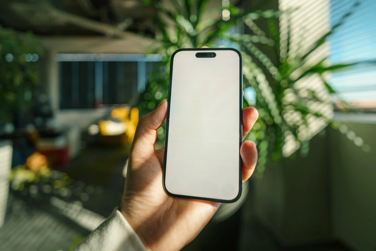
Picture a customer standing in their kitchen at half eight in the evening, phone in one hand, looking for someone to do the job you do. They tap your site, wait, pinch to zoom, squint at a phone number they cannot tap, and back out to the next result. You never hear from them, and you never find out why.
That is the reality for a lot of small business websites. They look fine on the laptop the owner built them on, and they fall apart on a phone. Since most people searching for a local business are on mobile, the phone version of your site is the real version. This post covers what makes a website mobile friendly, how to test yours in a couple of minutes, and the handful of fixes that make the biggest difference.
What does mobile friendly actually mean?
A mobile friendly website is one that adjusts itself to fit a phone screen, loads quickly on mobile data, and lets someone read your text and tap your buttons without zooming or pinching. Google also indexes and ranks your site based on the mobile version, so a site that only works properly on desktop is being judged on its weakest side.
In plain terms, it means a visitor can find out what you do, see that you are trustworthy, and contact you, all with one thumb.
The mobile checklist
Here is what to look for on your own site, in the order that matters:
Text you can read without zooming. Body text around 16px or larger, with decent spacing.
Tappable buttons. Big enough for a thumb, with space around them so people do not hit the wrong one.
A clickable phone number. Tapping it should start the call, not copy digits to a clipboard.
Fast loading. Big unresized photos are the usual culprit. Speed matters even more on 4G than on wifi, which is why a fast website for small business owners is worth the effort.
A short contact form. Name, phone, message. Every extra field costs you enquiries.
Booking that works on a phone. If you take bookings, the widget needs to open and work on mobile, not just on desktop.
No horizontal scrolling. If the page slides sideways, something is wider than the screen.
How to test your site in two minutes
Pick up your phone, open your website, and try to book yourself in. Do not use the laptop. Time how long the homepage takes to appear, try tapping the phone number, and fill in your own contact form. If anything makes you sigh, it is losing you work. Then ask a friend who has never seen the site to do the same thing and watch where they hesitate.
A worked example
Say a mobile nail technician in Kent gets most of her enquiries in the evening, from people on their phones. Her site opens with a large banner photo that crawls on mobile data, and her price list sits in a table that runs off the edge of the screen. Two changes would fix it: shrink the hero image, and set the prices out as a simple list instead of a table. Nothing clever, just the page behaving itself on a small screen.
Do I need a separate mobile website?
No. You do not need a separate mobile site. Modern websites are responsive, which means one website reshapes itself to fit whatever screen it is opened on, from a phone to a desktop monitor. Building a second mobile-only site would just double the work of keeping everything up to date.
Every site built on aceSites is responsive by default, so the mobile version is handled for you. You can start a free 30-day trial, no card needed, and check how your pages look on a phone as you build them at https://ace-sites.co.uk.
Keeping it mobile friendly over time
Mobile friendliness is not a one-off job. Every time you add a photo straight from your camera roll or paste in a wide table, you can undo it. The trick is to make edits on a builder where you can see the mobile view as you go, and to keep pages simple enough that there is not much to break. Sites that are easy to update yourself tend to stay tidy, because you fix small problems as you spot them instead of putting it on a list for someone else.
Conclusion
If your website only works properly on a laptop, you are hiding it from most of the people trying to find you. Readable text, tappable buttons, a phone number that dials, quick loading and a short form will do more for your enquiries than any redesign. If you would rather not wrestle with it, aceSites is a DIY builder where the mobile version takes care of itself. Start a free 30-day trial, no card needed, have a play, and build your own site from £19.99 a month at https://ace-sites.co.uk.